
How to Deliver an Impactful Financial Presentation?
By Ashish Arora
Presenting a huge chunk of numerical data, statistics, analysis, and financial statements in an easy to comprehend manner is indeed an uphill climb for most of the presenters. Even experienced financial and accounting professionals have a hard time drumming up some interest in mundane financial presentations. Many times, despite all efforts to make slides dynamic and engaging, speakers fail to establish an authentic connection with the audience, and their presentations fall flat.
To help you overcome this dread, we have provided some useful tips in this blog post that will be instrumental in preparing and presenting your financial data in the most relatable manner, without overwhelming or confusing the audience. Have a look!
01. Turn Complex Data into a Gripping Story
Every number has a story behind it. You just need to represent that story, translating the data into information and information into knowledge. So, shift your focus from telling your audience “what” to explaining them “so what” and “now what.” But for this, you first need to understand the meaning of the number and how it can generate value for the audience.
For instance, you have statistics – the profit increased by 30% over the past two years. You can convert this data into meaningful information for the intended audience by weaving a compelling story around the reason behind the growth.
What? The profit of the company increased by 30% over the past two years.
So what? Add a human element to take your story to the next level. For example, you can tell that the majority of the growth in profit was due to the success of our salesperson Anderson. Anderson focused on building and nurturing relationships with major enterprises over the period and secured a number of contracts. One of those contracts alone led to half of that 30% growth.
It will give a clear message to the sales team that for the continuous growth of the company’s profits, all the salespeople are required to learn from Anderson and concentrate on landing larger, prestigious client accounts.
Now what? You can explain strategies or the changes that need to be implemented to maintain or increase the profit.
02. Make Data Meaningful by Using the Right Visuals
The human brain is hardwired to visual communication. The visuals can make or break your finance-based presentations, so choose them wisely. There are many ways to illustrate your data – infographics, charts, tables, graphs, etc., but all visuals don’t fit well with all sorts of information, and you can’t choose a visual just because it looks cool. For instance, the growth or decline in the business revenue over the last five years can be better represented through a graph instead of infographics.
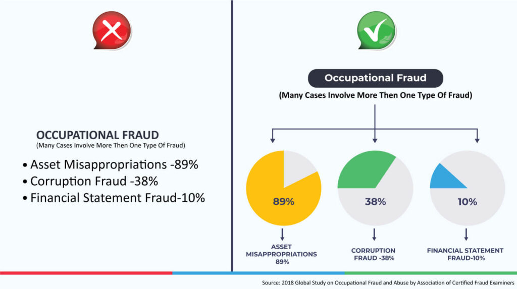
Look at the information below – which one looks more eye-pleasing?
Here are a few tips on the right visual selection:
- Pick the visual that better conveys your message to the audience and helps them retain it for longer.
- Ensure that the charts or graphs that you are using are clean and free from clutter.
- Color plays an important role in evoking emotions. To keep visuals brand-consistent, choose colors from your corporate palette.
And if designing is not your cup of tea, you can use pre-designed templates and visuals to make your data-heavy presentations simpler and comprehensible.
03. Cut out Needless Bells and Whistles
Your presentation software offers you several features, but it doesn’t mean that you have to use them all. If you attempt to use all the features just for the sake of making your presentation look appealing, you end up making it more dreary. So, your efforts must be to make your presentation attention-grabbing and easy to understand using the relevant features.
Further, keep in mind that your slides are not a document, so avoid brimming them with unnecessary numbers and information; it will only baffle your audience. Also, avoid clutter in visual elements by not including needless gridlines, labels, axis titles, data tables, tick marks, etc.
For example, consider the graph below. The first part looks messy and difficult to understand. The same graph can be represented more simply and easily. Take a look at the second part!

The Bottom Line
Relying solely either on text or visuals for representing huge data sets and financial statistics would not yield the desired outcome. You need the fine blend of both – the text and visuals to highlight your core message in the presentation, make it easy for the audience to follow, and encourage them to take some action.
Using the above-mentioned tips, you can give a creative makeover to your data-driven financial presentations and keep the listeners awake and alert.
Author Bio:
Ashish Arora is the Co-Founder of SketchBubble.com, a leading provider of result-driven, professionally built presentation templates. Travelling the world to gather new creative ideas, he has been working in the digital marketing space since 2007 and has a passion for designing presentations. You can also find him on Twitter or LinkedIn